Twitter aka X
Twitter or X, whatever you want to call it, has been constantly facing an 'image' problem. In other words, an identity crisis. For people who aren’t regular users of Twitter, it’s hard to make sense of what the platform is after its recent rebranding to X.
Is it a news app? Is it the old Twitter, which was a social media platform, or the new X, which is suddenly a 'global town square' and an app to get 'the news quickly' under the same mask?
The problem isn’t direction or Elon’s takeover. Infact I think the platform now has a purpose bigger than being a social media, something social media constantly try to achieve. The problem is half baked execution.
Non-Linear Rebranding
Inconsistency runs wild when it comes to implementing X’s new brand for the user. Masked under the old Twitter identity, its colors and its sounds, the brand lacks a distinctive touch for such a serious directional change. The sole reason why each element is looked at closely when branding is done is to ensure consistency in the user’s perception and its presentation at touchpoints.
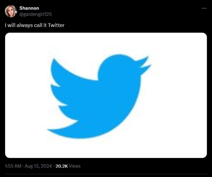
X needed a serious look at its brand, its visual representations, and its overall brand tone. Instead, it was done non-linearly, so much so that people still want to call it Twitter even though the platform's rebranding attempt started in July 2023, over a year ago.
Why rebranding or a design overhaul works is clear with the above tweet. A brand isn’t just its logo, it isn’t just the animation, it isn’t just the tone it uses at customer touchpoints; it’s the consistent combination of all of them.
Make it non-consistent, and you're stealing the user’s platform where they've spent so much time, the platform’s reputation, and so on.
The above tweet stands true with this fact. The blue bird is Twitter; it represents the platform. The user name 'Twitter' and the bird appear, the sound of tweeting, the notification chime—great brand consistency brought this image to Twitter, complementing the nostalgia effect.
Confusing marketing
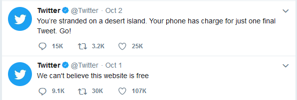
Great brand consistency at Twitter has confused the people working there. Below are a few tweets from the official account when Twitter was only Twitter (October 2018):
And a few posts from Twitter’s official account now that it’s X (June 2024):
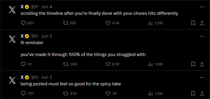
The marketing efforts have been inconsistent with its image because it’s Twitter; it’s not a new platform with an ‘X’ logo—it’s still Twitter. It’s hard to wrap your brain around how the platform’s portrayal is equally non-linear, from their social media manager to their CTO, Elon, who regularly posts stock logo intro animation videos for some reason.
There is no identity for the new platform, and it’s obvious that gap is being filled by its previous one. Branding is essential, and rebranding is risky if not done properly. The logo, the colors, the UX—everything matters for a brand image, especially if you are a platform known for giving others their identity.
Sooner or later they will realize. But till then X is a good case study for brand designers.